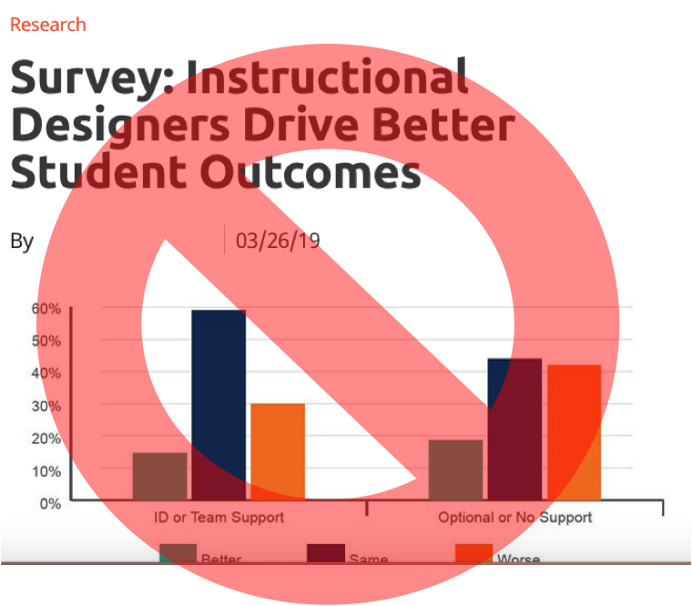

This article, Instructional Designers Drive Better Student Outcomes,
made the rounds in 2019 and now that it is time for end-of-year
reviews, it is popping up again. I need to make my objections to the
conclusions of this article known because if I was a CEO and handed this
article as justification for an Instructional Design (ID) department,
I’d toss the article back across the table.
Poor research is worse than no research.
Before
I articulate my objections and show you some tips on how to analyze
research papers, I would like to state my philosophical bias clearly: I
am, by degree & interest, an Instructional Designer. I believe that
Instructional Designers can create and improve instruction. There
is a plethora of bad instruction out there and I’m part of the group
that supports better instruction.
Please be clear on this point because
now that I’ve said that, I think the 2019 CHLOE 3 Report (hereafter referred to as the report, APA reference at bottom of this page) together with the Campus Technology article (hereafter referred to as the article) headline are garbage.
Objection #1: Analyze the population and sample.
From the very first paragraph of the article, the claims seem compelling:
“When
faculty are compelled to work with instructional designers on
development of their online courses, students have better outcomes,
according to a recent survey from Quality Matters and Eduventures Research,
the research division of ACT/NRCCUA. In schools where instructional
design for online course development was absent or optional, 58 percent of
“chief online officers” (COOs) believed that students taking those
courses would perform at least as well if not better than those in
face-to-face classes; that jumped to 70 percent where instructional design was mandated.”
Mind
you, depicted directly above this paragraph is a graph which does not
show a 70% Y axis interval.
Hmm…70% in the text and no 70% on the graph? That’s your first sign that something might be wrong. These
numbers might be aggregated…as in…more than one category of
responses has been added together to get a bigger number. At this point,
that is not a research sin. But which numbers were added?
Better and same? Same and worse? What? I get the feeling that the graph
and this paragraph, even as they are snuggled together, might not go
together. It might mean that the writer is reaching for conclusions
(pushing the data) that the data doesn’t show. Hackles raised. I’ve got
to get my hands on the actual data.
I surfed off to find the 2019 CHLOE 3 Report.
In order to obtain access, I had to fill out a form.
Interestingly, on the form I was given the option to disclose that I, myself, am a COO. I gave that a moment of thought. Hmm…okay, so I am technically the COO of my own home office. But…does that mean I will be surveyed for the next CHLOE Report?? We’ll see.
(I *will* update this article.) Immediately, the problem here has me
asking, “Who exactly did they survey?” Just people that disclosed they
were COOs? And by what standard? Because they said so? Because they
clicked “I am the Chief Online Officer or equivalent?” Is it possible
that only progressive, forward-looking campus representatives even read
or know of the CHLOE survey? Maybe only the technologically jazziest
COOs reply to surveys? Or maybe COOs that have time to read their email
and are, perhaps, not the least bit jazzy?
Point of order: whether you are a COO or not, why do you need this information to give me access to your report? Casting my very best Spock raised eyebrow at you.
My
notes say I received this report on June 26, 2019 at 7:23 a.m. Eastern.
CHLOE does a breakdown of the respondents on pages 6-8. I can’t filter
out the “jazzy” factor but this report goes to great lengths to tell me
the demographics of these respondents. Wow. The stats person on the
other side of this was on full caffeine the day they ran this data.
Objection #2: The data. What was actually collected?
I’m
searching for the data on the use of instructional designers. ID is on
pages 22-24. I’m looking for 70% (a good anchor number to scan for since
it was at the front of the article).
A search found 70% in two places in this PDF between pages 22 and 24.
What’s
this? This time the report snuggles the 70% directly up to the same
image from the article and yet, there is no 70% on this diagram either.
This
70% does not seem to be related to that headline. It’s just reporting
that among enterprise institutions, 70% of them grant faculty
autonomy/academic freedom as to why instructional design is absent or
optional. Not relevant for my writing.
But I want to get to the
heart of the data question: What did they measure? I scoured this
section (and the whole report really) and found this was the most
descriptive response:
“A higher proportion of COOs at institutions that require ID use in online course development judge their fully online students as performing comparably to or better than on-ground students than claimed by COOs from institutions that do not require ID support”
Bold
emphasis added by me. Thus, the survey respondents judged and claimed.
No problem with that as surveys can collect opinion results. But let’s
look at the headline again:
Instructional Designers Drive Better Student Outcomes
That’s not what the data shows is it? The survey did not measure student outcomes. It measured the perception (judge, claim) of student outcomes.
It collected subjective data. Is it possible that COOs love their ID
departments and don’t want anything to make them look bad so they
responded, “Of course my ID department helps, that’s why I have one!”
The
survey did not appear to ask for objective student outcome data at all.
*CHLOE 3 authors if you did ask that question, please clarify. Hint: If
I was a CEO, *that’s* the data I’d like handed to me.
At this point, my interest is really peaked.
 |
| CHLOE 3 Figure 15 |
I’m struggling to make the diagram match anything
in the written accompanying text.
Objection #3: What does the diagram actually show?
Let’s use our graph reading skills and dive in.
First, the data appears to be split into 2 groups:
Option A:
- Left side: Online student performance (perceived)
- Right side: On-ground student performance (perceived)
Or
Option B: No sure which columns refer to online versus on-ground, but X axis seems to claim with or without ID support.
- Left
side: With ID support (assuming that knowing whether your institution
has ID support is a determinable fact, not an opinion) - Right side: Without ID support.
Since
the title takes up a great deal of real estate in a graph, it’s fair to
say that it should be the more dominant piece of data, so I’ll assume
Option A is the correct interpretation of the two groups. Bear in mind
at this point, that this graph is showing the (perceived) difference ID
makes in two different populations (online versus on-ground) and not
what difference ID makes versus non-ID. Remember the headline said Instructional Designers Drive Better Student Outcomes, no mention of online versus on-ground.
However, I’m willing to analyze this graph based on three separate
assumptions (ID versus non-ID, online versus on-ground, and mix those
groups up too) so let’s continue.
The Y axis is showing us
percents so really quickly, we should decide if this is a number that
*should* add up to 100% maximum or could the total percent go higher?
Some aggregates can go higher than 100% if a respondent can pick more
than one answer. Scanning these columns, it looks like if you added all
of the columns of a group together, we’d get 100%. OK. So these
respondents could not be part of more than one column. Each respondent
had to be part of a discrete, exclusive set.
Reading the colors, the turquoise columns are those COOs that felt that their student performance (interestingly, not student outcomes?
Watch that vocabulary crossfire boys!) was better with ID. So referring
to my philosophical bias, we like this group. Yay! But they seem to hit
the 15% and 19% mark. Ugh, those are not high numbers.
The dark
blue column is the COOs that felt that their student performance was the
same. Now I will make a leap here. I can be argued against this but I’m
going to take the stance that any set of data that indicates a result
of ‘same’ probably shouldn’t make headlines. Notice however, that these are the largest columns.
So in an alternative universe, the article could have been titled
Instructional Designers Seem To Make No Difference In Student Outcomes.
No column crossed the 60% threshold either.
The orange column is the COOs that felt that their student performance was worse with IDs.
OK, I gotta stop here for a moment.
Bwhahahahahahahaha!
I love it when a plan…
totally explodes.
As you can tell, I have disdain this group and wish it did not exist. However, the scientist in me loves the fact that I have to acknowledge that it is possible
that the presence of ID could totally muck up the works. Statistically,
it is possible that there are institutions filled with awesome
teachers, doing the best instruction, utilizing the best learning
science, and creating wonderful learning outcomes. Insert a mediocre (at
best) ID with a job task to, for example, input boilerplate language
into every syllabus, and it is possible that (perceived) student
outcomes take a hit. This data just makes me laugh. But I’m not laughing
that much because those columns are pulling 30% and 42%, both numbers
higher than my beloved turquoise. Owch. Pipe down.
OK.
Still, look at that headline again: Instructional Designers Drive Better Student Outcomes
Remember that I’m not nit-picking an insignificant detail here. This diagram is the prominent one showing in the article.
But does the data supported that headline? Even if I tried to pretend
it did…how does 15% and 19% surpass 59%, 45%, 30%, and 42%– all of
the columns that said that ID presence had no effect or a worse effect.
There are times when a low number can and should make a headline.
This…is not one of those times.
In conclusion, pulling
the article headline from this report was a pretty gross exaggeration of
the data. But CHLOE 3, you are not exempt either because I’m still
spinning on your 70%. This was the paragraph immediately preceding the graph:
“In
Figure 15, CHLOE 3 supplements these findings with evidence that a
higher proportion of COOs at institutions that require ID use in online
course development judge their fully online students as performing
comparably to or better than on-ground students than claimed by COOs
from institutions that do not require ID support (70% vs. 58%).
Conversely, 12% or more COOs from institutions that do not require the
use of ID expertise reported worse performance by online students than
COOs from schools mandating ID involvement.”
I take issue with: “a
higher proportion..that require ID use…in online…judge…as
performing comparably or better than on-ground that do not require ID
(70% vs. 58%).” This one sentence almost needs a flow diagram to unpack.
So they want to compare:
Online AND “better or same”, that’s left side turquoise plus blue, 15% plus 59% = 74%
against
Ground
AND “not require ID” (no other different specification in the sentence,
so we’ll go with a continuation of the first specification of “better
or same”), that’s right side turquoise plus blue, 19% plus 45% = 64%.
The
difference between those two groups (74% minus 64%) is 10%. They say
it’s 12% (the difference between 70 and 58, not the 12% in the following
sentence of their quote). I spent over an hour playing with the numbers
from the graph but I cannot easily show you the calculations on this
LinkedIn article. In summary, I’m more comfortable finding 58% from the
graph than 70%.
To be fair, it is very possible that these sets of
numbers, 70% and 58%, reside inside a set of data that the report
authors is not providing, despite starting the sentence with “In Figure
15.” Said another way, the data is real and valid, just not available to
my eyes. That is a completely fair possibility. Occam’s Razor actually
predicts that that has the highest probability of being true
because despite me playing with those percentages and trying to add them
up in different ways; it takes contortion to get 70 and 58. Thus, I am willing to go with their 70% and 58% because I have no other stronger evidence to work from.
Don’t
mistake what I am getting at here. I’m not saying that their 70 and 58
are false, fake, or poor. I’m saying if you’ve raised my interest, I’m
going to use all of my skills to second-guess your work. As my former
students know, I will fight hard if I align myself with your interests. But first you have to win me over.
I need to step back and look at these numbers again.
Reading
that sentence over again a few times, they are comparing apples to
oranges: Online courses with ID support perform better or the same than
on-ground courses with no ID. Um…that’s not a fair comparison, is it?
(I know, I’ll carry the Clark versus Kozma debate with me for a VERY
long time. Only IDs get that reference.) To be clear, the confounding variables in this comparison are that online courses are:
- often hosted inside of online learning management platforms
- of which Instructional Designers are tech experts and gatekeepers
- that might be working to high internal standards like objectives and assessments.
And just to muddy the water a little bit more, many campuses now use online learning management platforms as integral parts of on-ground courses.
Therefore, the effect of adding in a tool that provides a great deal
more advantages in terms of access to grades (feedback), course
strategic planning, and insertion of required but helpful boilerplate
language (i.e. here is where to find the Math Lab) ought to drive better
student outcomes regardless of where the classes took place.
This conclusion is like telling me that people who live in the light see
better than people who live in the dark. I’m going to toss that
research conclusion out and say “Tell me something I don’t know.”
Furthermore, 12% isn’t busting down any doors, especially when it contains within it the group that felt that ID’s impact was the same. That’s like asking me if I’d like some 14% hot coffee with my 56% lukewarm coffee. Urm. No?